Update – 22/10/22
After receiving feedback for Cue The Minimal, I made the following changes:
- Added sound effects to ball collisions
- Added the ability to reset player position back to start using the 'T' key
- A message will appear on the screen if the player falls down a hole to prompt them to reset their position
- Added an invisible trigger below the holes that count how many balls have fallen in
- Once the count reaches 10, a message will appear on screen that prompts the player to press 'R' to restart the game and play again
- Found an issue where some balls will sometimes fly outside the room, added a trigger to catch these balls and reset their position back inside the room
The Plan
Cue The Minimal is based on Minimalism, particularly around the work of minimalist artists Donald Judd and Dan Flavin. I found I could relate to Judd’s design choices in some of his sculpture works, mainly the fact that he designed the works to be identical in size and shape, and positioned them at an even and exact distance apart. I find in my own digital design work I pay close attention to detail with size and space, always choosing to use exact measurements over rough estimations. I love the aesthetic look of Flavin’s works. The simplicity and cleanness that comes from light against a neutral tone is satisfying to look at. I think portraying Flavin’s art in my project will be the most difficult process as I don’t have much experience working with light, especially in a 3D space.
The idea to create an environment based on a pool table came to me after being prompted to think of a space I enjoy being in. Before moving interstate, I had spent a lot of time at a local pool/snooker bar. In fact, it’s where my fiancé and I had our first date, so it holds genuine meaning for me. It was an easy decision. At first, I thought about designing a small room with one pool table in the centre and enough space to enable the player to walk around it. However, this didn’t completely represent Minimalism ideals as it was too much of a representation of the real physical space. When I thought about the fact that this was a digital creation with next to no restrictions other than my technical abilities, I realised the pool table could be the environment. This gave me the opportunity to design interaction between the player and the balls, a giant game of pool!
Rules I set out to abide by (as much as possible) during the design and creation of my interactive environment:
- Minimal number of polygons and objects
- Minimal colour scheme (for the sake of saving time)
- Minimal interactions and have a clear aim for the player
- Don’t add unnecessary cosmetics to the scene, only what enhances the space for the player/viewer
- “Foreground the role of the viewer in aesthetic experience” a.k.a. Make the player realise their role in my small interactive environment
The Process
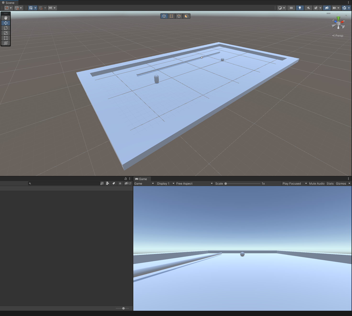
I decided to base my table on an 8-foot billiards table. According to the pool table dimension guide (fig. 1.1), the standard ratio size for a pool table’s playable space is 2-to-1. This made it easy to size up in Unity which I did by creating a plane and setting the Z scale to be half the size of the X scale.
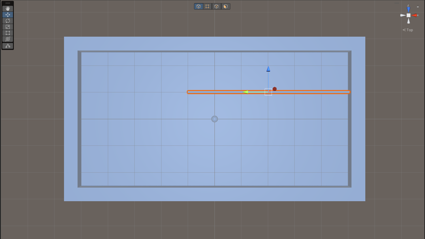
A standard cue length is roughly 65% of the longest side of an 8-foot table. I used the grid in Unity to size it up (fig. 1.2).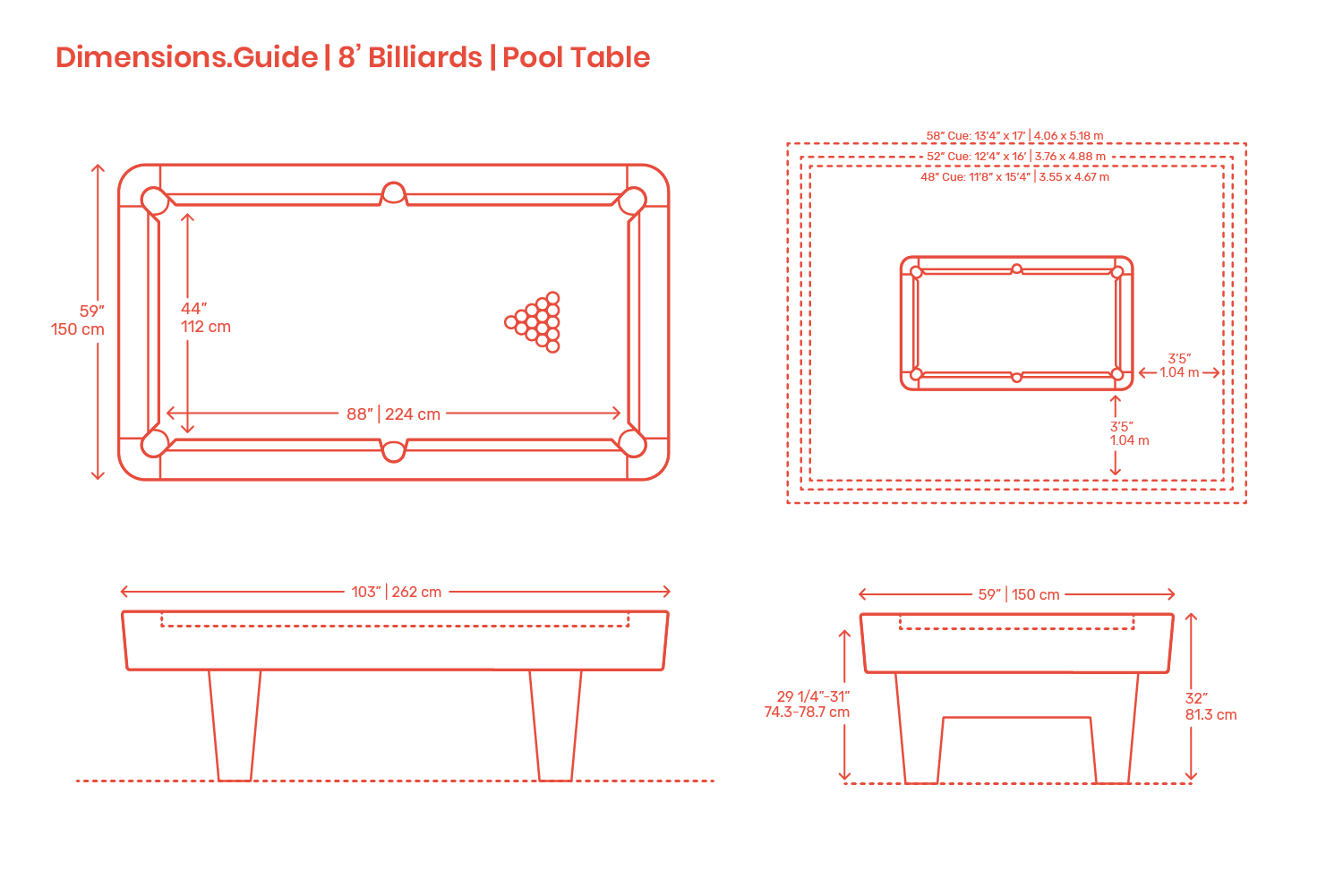
There are different balls depending on the region or the type of game (fig. 1.3). In my experience I’ve always preferred playing with smaller ones, so I chose the English variant. Using the same calculation as before, the ball size is approximately 2% of the long side of my table, and since my table is 10 grid squares long, I’ve made the X, Y, Z scales of the ball 0.2 of the size of 1 square.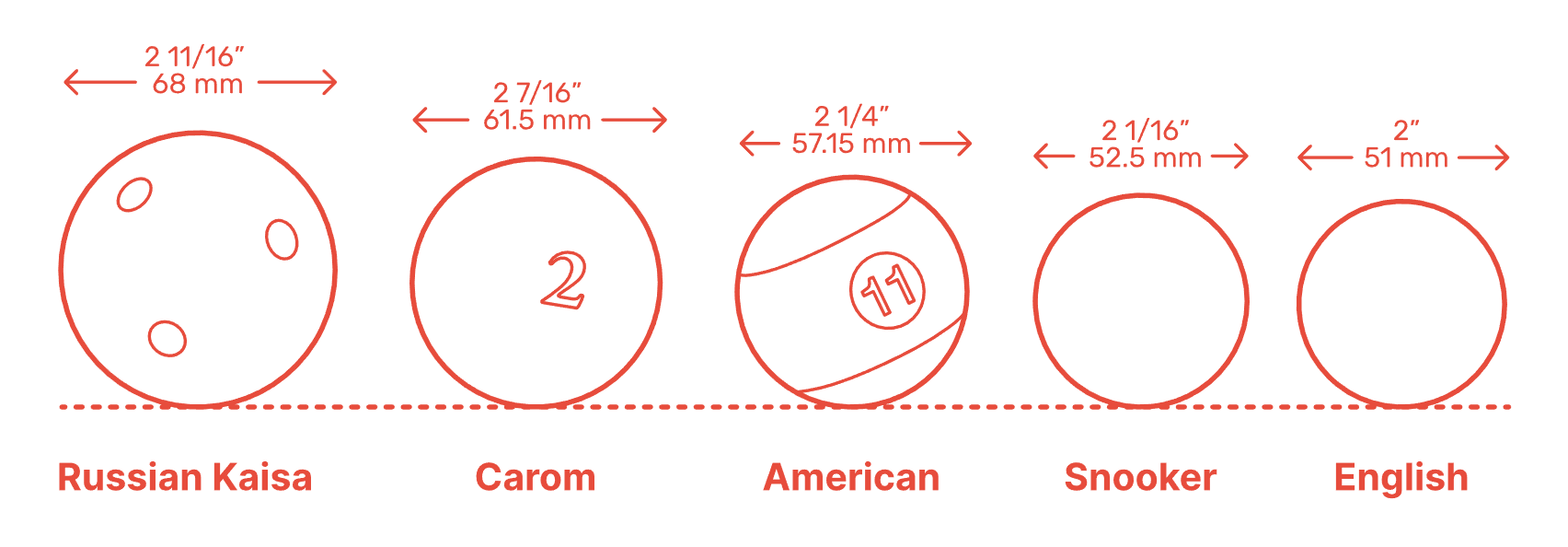
Only after I figured out the sizing of these object did I decide to add the character controller into the scene (fig. 1.4), which unsurprisingly, made me realise everything needs to be scaled up. I played around with a few different scales and settled on 5x (fig. 1.5). This felt like enough space for the player to push the balls around while not feeling tedious to move across long distances.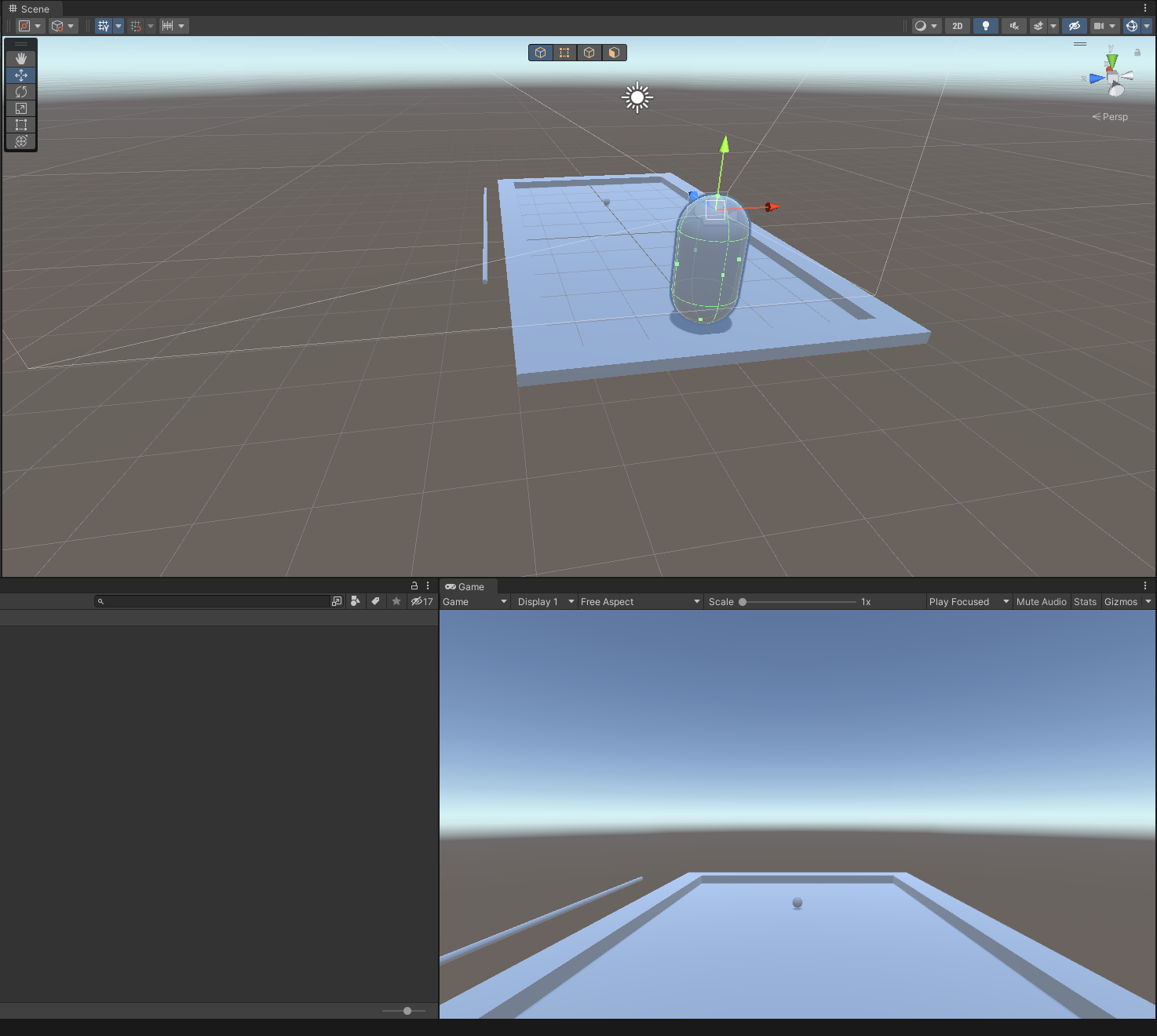
Now that the sizing was figured out, I moved on to the interaction between the player controller and the balls. My aim was to have the player hit the balls into any of the holes by running directly into them. Before attempting to search up anything I made sure all surfaces had a mesh or box collider attached (I am unsure which was better to use but I went with box). I then tested running into a ball and expected to be stopped by it on collision, but instead I just ran right over it. I figured this was to do with the Step Offset setting on the Character Controller component and changed it to 0.1 which fixed the issue.
I searched a tutorial on YouTube to make objects move on player collision and found one that was easy to understand, and the code was barebones which aligned to my rules for the project. I added it to my player object and got it working straight away. I was also delighted to see that pushing a ball to collide with another ball worked as expected as well.
With the interaction part done, I moved on to designing the space. I made the holes in each corner of the table less “boxy” to ensure the balls wouldn’t get stuck around the edges of the hole. This is where I brought in the ProBuilder add-on in Unity to create a pipe shape for the hole (fig. 2.1). The rest of the scene was created using Unity’s basic cube, sphere, and plane objects. I grouped sections into an empty parent object, such as the table corner and hole, so it was quick to duplicate and get each section into position using the rotate and position values.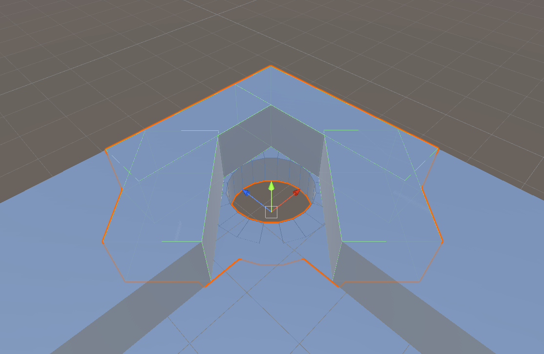
I duplicated the ball object and moved them into the standard starting position of balls on a pool table, although I didn’t plan this to be final as it’s too representational of the real game and felt it didn’t meet my minimalism rules I set out in the beginning.
Finally, it was time to take a crack at lighting. One distinct thing about the pool tables at Snooker World I always loved was the long warm light hanging over each table. I wanted to replicate this in my scene and chose to use two spot lights centred over the table but spaced apart to create more distance for the light (fig. 2.2). I changed the light colour to a warm subtle yellow, increased the range and spot angle, and decreased the intensity until I was happy with how it looked in the player’s camera view.
I marked this point as a milestone in my project and decided to take time away from it to reflect on the process and how it aligned with my intentions to be a minimalist piece (fig. 2.3).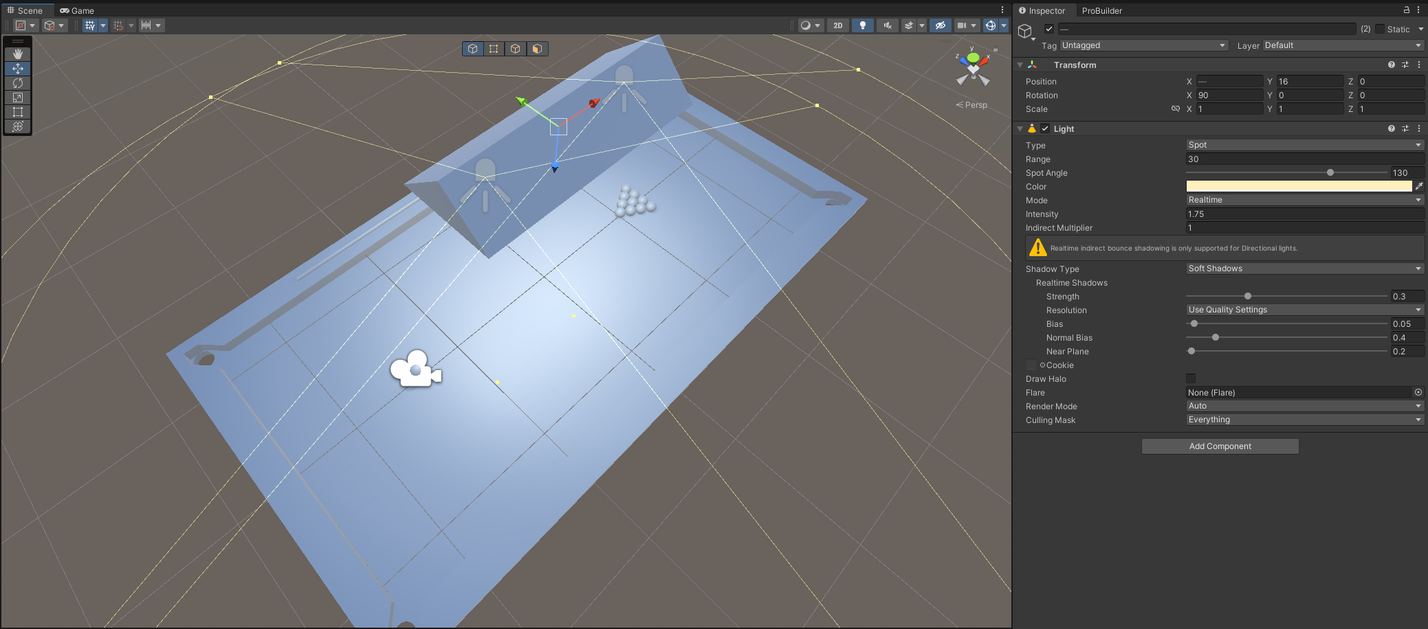
After some reflection I felt the design wasn’t meeting the expectations of my minimalism concept. There was too much focus on the representation of a real pool table, so I made some changes to the space.
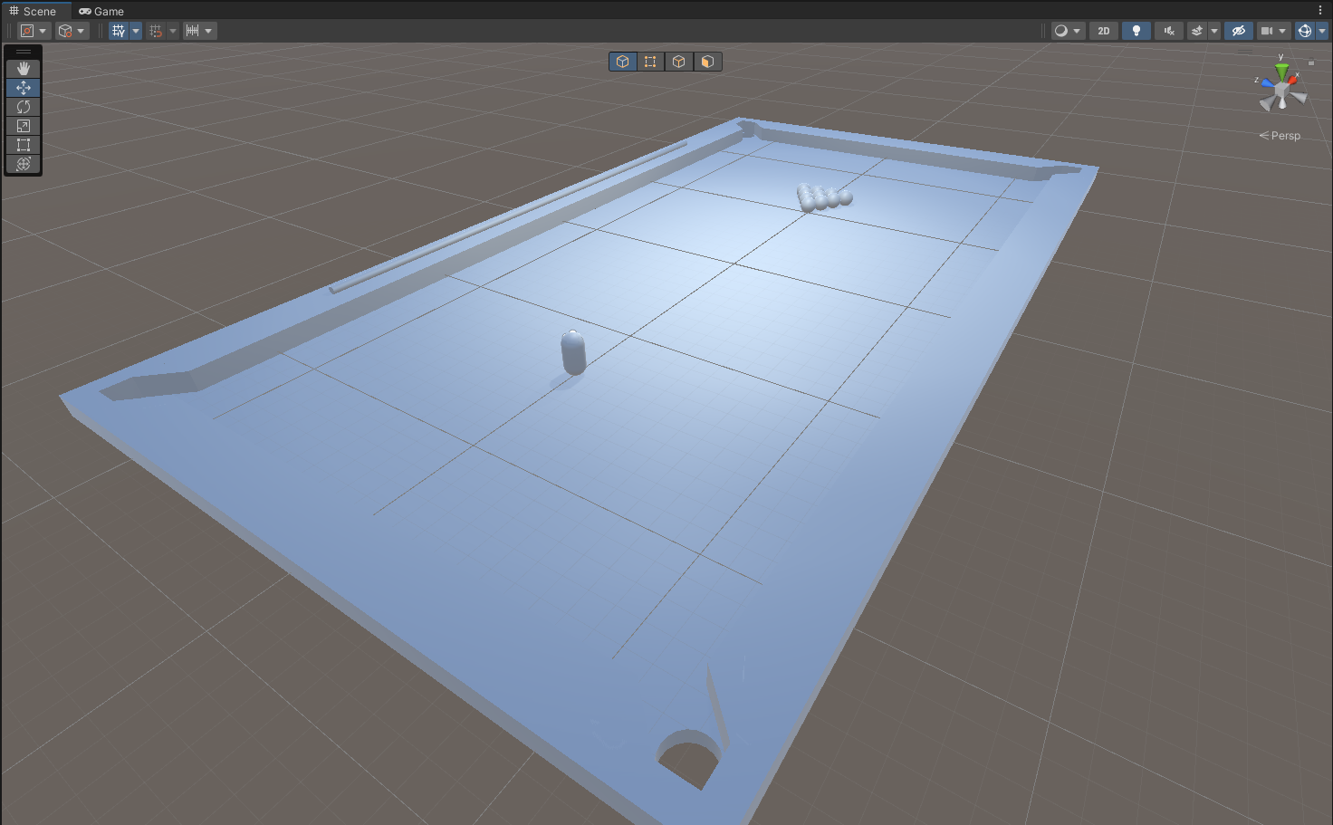
I closed the space to create a small room by selecting the objects that make up the sides of the table and increased their height to just above the spot lights. I created a cube for the ceiling and duplicated it for below the table, so the balls have a space to go after falling through the holes. I tested the new space and discovered that the player could fall into the area under the table too. Because the floor of the table is a plane object, the underside of the mesh is invisible, which meant you could still see the whole room and the balls that were left in the main area above (fig. 4).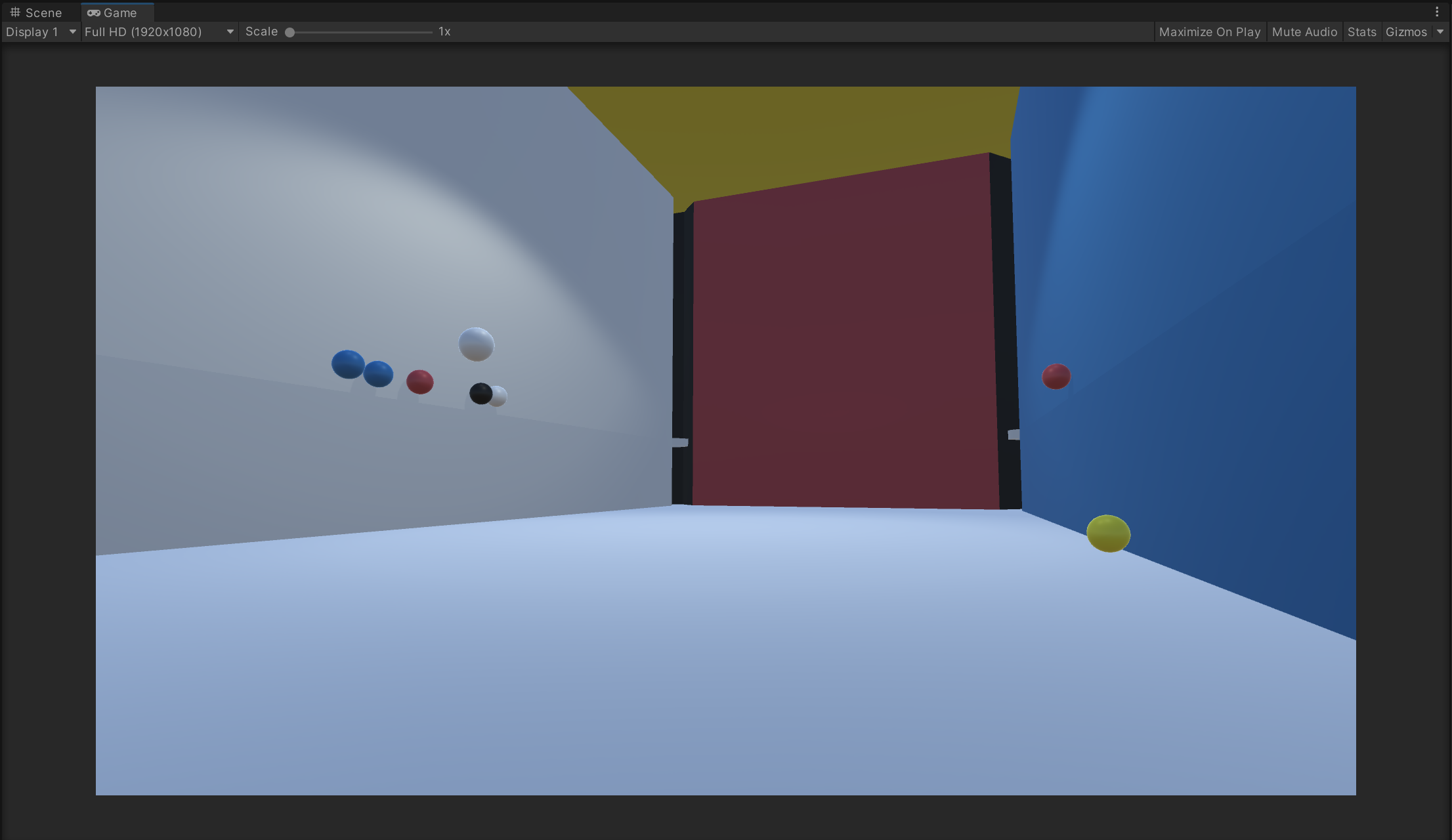
My goal for the colour scheme was to use minimal soft tones. I started off with the typical colours of pool tables: green for the base, brown for the walls. However, I thought this was uninteresting. I considered what I had learned about limits and constraints in design and remembered De Stijl. I created a material for each of the primary colours of the style, as well as a white and black material, then began to apply them randomly to objects. Immediately I found this to be way more interesting. The only colour choice that wasn’t random was the black on each corner of the room.
In the first build attempt I noticed full screen mode made the character movement feel slower and more laborious to hit the balls. The force speed of the balls when hit also felt slower. I changed the player speed from 12 to 13 and the force magnitude from 2.5 to 2.2. This made the speed of interaction feel more natural.
The Outcome
Overall, I really liked what I have made. It’s fun to move around trying to hit the balls into the holes. There’s variation in the interaction and choice for the player which only came to fruition while coding the ball collisions and playing around with it.