Southern Gold Coast Chamber of Commerce
Website Design + DevelopmentProfessional Project
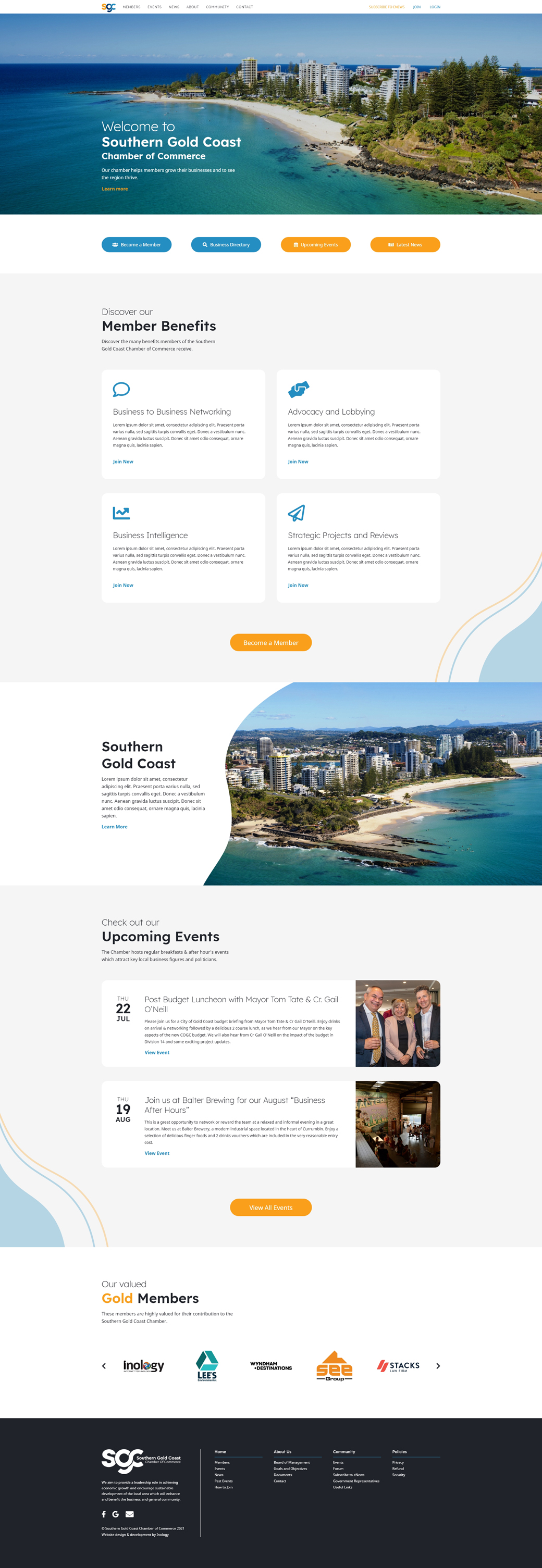
The Chamber wanted a fresh look for their website to accommodate their new logo design. Being one of the most active Chambers on the Gold Coast, the website needed to look professional and appealing. I incorporated the curved style of the logo into the design, and drew inspiration from the coastal landscape of the area that the organisation is situated in.
